The concepts of variable and variation are central to statistics. Statistical models seek to explain or account for variation in a one variable by the variation in other variables. Inferential statistics is about putting the explained variation in the context of what remains unexplained.
The LittleApp on displaying distributions is designed to help you introduce some common graphical displays of variation.

This app has a purpose that goes beyond relating histograms to data: to help students and instructors transition to more compact displays of distribution and to using graphical coordinates consistently throughout the statistics course. This is the subject of the next section, after which we’ll move on to the app itself.
Graphical axes should be chosen carefully!
Introductory stats texts use histograms, dot plots, and similar displays to show the variation in a single variable. In doing so, a distinct graphical modality is introduced: A graphical frame with the variable on the x-axis and a count1 on the y-axis.
Familiar though it be, the count-vs-value graphical frame has problems.
Wasteful: It uses up a graphical axis that’s needed for other purposes.
Most of an intro stats course is about relating one variable to another: correlation, simple regression, inference on a difference in probabilities or means. It’s natural to use one graphical axis for one variable and the other for another variable. Indeed, many stats texts introduce scatter plots early, a graphical mode that does exactly this.
Distracting: It introduces a numerical scale (count, density, …) that is not made use of.
It’s the shape of the distribution that matters, not how tall it is. In fact, if the count/density axis were missing, you could calculate it yourself with just the information on the x-axis and the knowledge that for histograms the sum of heights must add to the sample size n (and for densities, the area under the curve must be 1).
Confusing: There’s variation on both the x and y axes. Which one is it that we want them to see?
A common misconception for students is to judge variation by the up-and-down differences in heights of neighboring bars of the histogram. (See, e.g. the 2016 GAISE College Report, p. 100.) Students who have studied functions in a pre-calc course understandably and correctly think that variation in the function refers to the up-and-down range of the function. Indeed, this is what the mathematical “range” of a function is about.
Orientation to the app
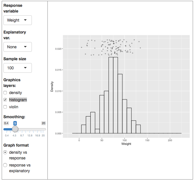
There are two main graphics in the app, but only one is displayed at a time. By default, the app shows a graphical frame in the standard form for a histogram: the variable on the x-axis and a density scale on the y-axis. The individual, case-by-case values of the variable are plotted parallel to the x-axis, using jittering for the y position in order to avoiding plotting one point on top of another.
You can choose how big a sample you want to use. Checkboxes control which of three different displays of distribution are shown. Easy.
Finally, there is a slider that sets the “smoothness” of the displays of distribution. The scale of the slider matches the scale of the x-axis. You’ll see this most easily by noting how the histogram bin width changes with the smoothing value chosen.
At the bottom of the controls, you’re given a choice of what type of graphical display to use. The default is the standard frame for showing histograms. The other is the standard frame for displaying one variable against another. Almost all of the other LittleApps will be using the frame of one variable against another. There’s a simple reason: almost all of statistics is about relating one variable to another (or several others).
Teaching with the app
The data are always displayed in the app. The statistical annotations need to be turned on.
When you start, a sample of n=5000 is displayed as jittered dots. Explain that the vertical position of the dots doesn’t matter. It’s a graphical device to keep the dots from being plotted one on top of the other. The horizontal axis, though, does matter. It shows the value of the variable itself. Change the response variable to make this more evident; the x-axis scale changes, too.
Turn on the histogram display. The data points have been positioned vertically so that they are like a cloud at the top of a mountain. Point out that the highest bars touch the cloud where it is densest. Bars are lower underneath where the cloud is less dense.
If you want to show or review how the histogram is constructed, turn down the sample size to 10 or 20. Then you can show that the height of the bar reflects how many data points are above that bar. Change the width of the bars using the smoothing slider control.
Now turn on the density display along with the histogram. The density is a close match to the histogram, but without the distracting hard boundaries of the histogram bars. Increase the sample size and show what happens as the smoothing parameter is increased and decreased.
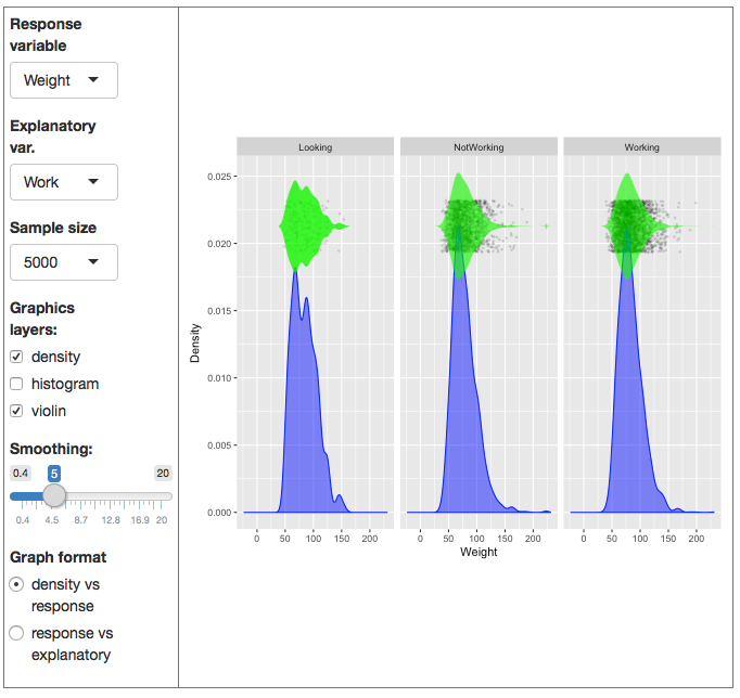
Next, turn on the violin display. This is the same as the density, but plotted directly over the data. The violin is wide where the data points are dense.
It’s time now to select an explanatory variable. Each of the ones provided divided the data into groups. The graphical display involves a facet for each group, as shown below.

Facetting is a valuable graphical technique, particularly when you have three or more variables to display. We need it here because it would be confusing if the densities or histograms for the different groups were displayed. The root of the problem – what makes us need a graphical mode that involves three different scales – is that we used up the y-axis in order to show the numerical value of the density. But in reality all we need is the shape of the distribution.
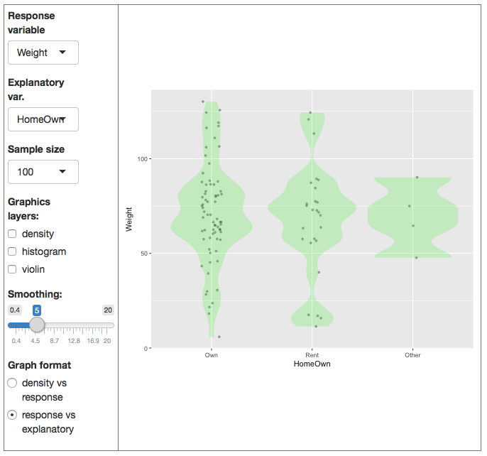
Time to change the use of the x- and y-axes to make it easier to compare the different groups.

We’re going to denote the values of the response variable as the vertical position and use the horizontal axis for the explanatory variable. The violins can be plotted on top of the data to make it easier to compare the density of the distribution for different groups.
Or perhaps probability or probability density↩
