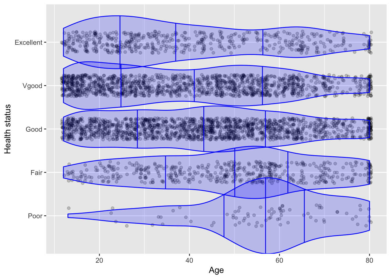
In StatPREP, we make extensive use of a graphical technique called jittering. It’s likely that the word “jitter” is not in the index of your textbook. This is a shame, because jittering is a useful technique, allowing you to use a consistent graphical format for both quantitative and categorical variables.
As an illustrative example, let’s look the relationships among health, age, and hours spent watching TV. These are a handful of the 76 variables relating to health, lifestyle, and economic situation from the National Health and Nutrition Evaluation Survey (NHANES).
TVHrsDay: Hours of TV watched per day. This could be quantitative, but in NHANES it’s recorded on a discrete scale.HealthGen: Self-assessment of health status on a five-level scale from excellent to poor.Age: Age in years.
Let’s look at health status versus age. A textbook choics for a graphic involving one quantitative and one categorical plot is a box-and-whisker plot:
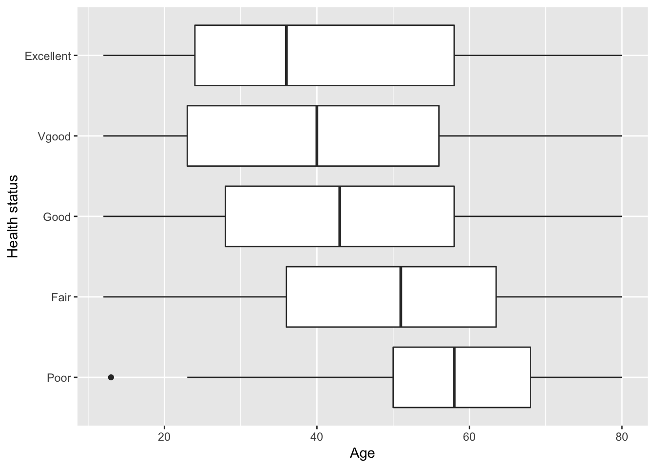
A plot like this can be hard to interpret. For instance, how does the health of 70-year olds compare to 30-year olds? Are there a lot of people in excellent health, or are most people in good health?
A scatter plot format doesn’t work here. You just have to see it to know why:
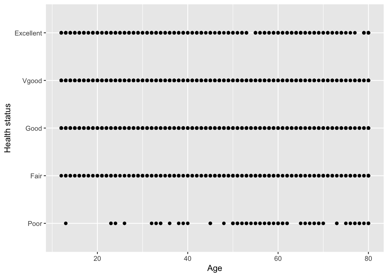
All of the 30-year olds in good health are placed at the same point. We can’t see whether there are a lot or a few of them.
Jittering moves each individual person’s point a little bit away from the horizontal line for their health group. Combining jittering with transparency, you can get a good idea about how the people are distributed across age and health category:
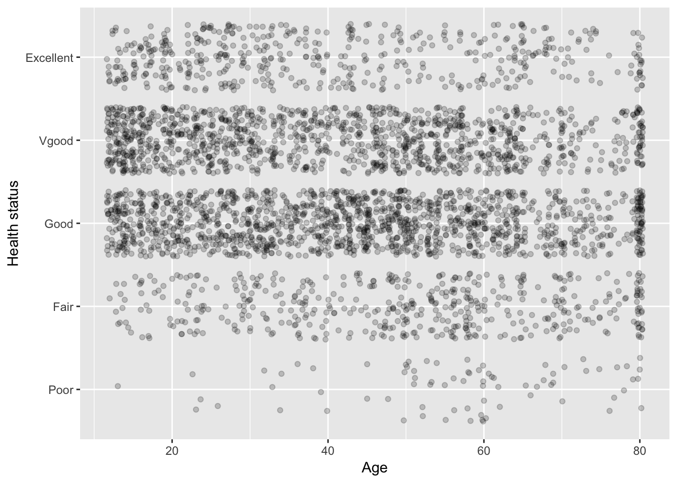
At a glance, you can see that the large majority of people report that they are in good or very good health. Looking at the 70-year olds, you can see that most of them are in good or very good health as well, not so different from the 30-year olds. Would you have been able to read that from the box-and-whisker plot?
Another nice aspect of the jitter plot is that each and every dot has a definite meaning: it’s a individual person of that age and health status.
Using a scatter plot format with jittering doesn’t prevent you from annotating the data, e.g. with a box-and-whisker plot.
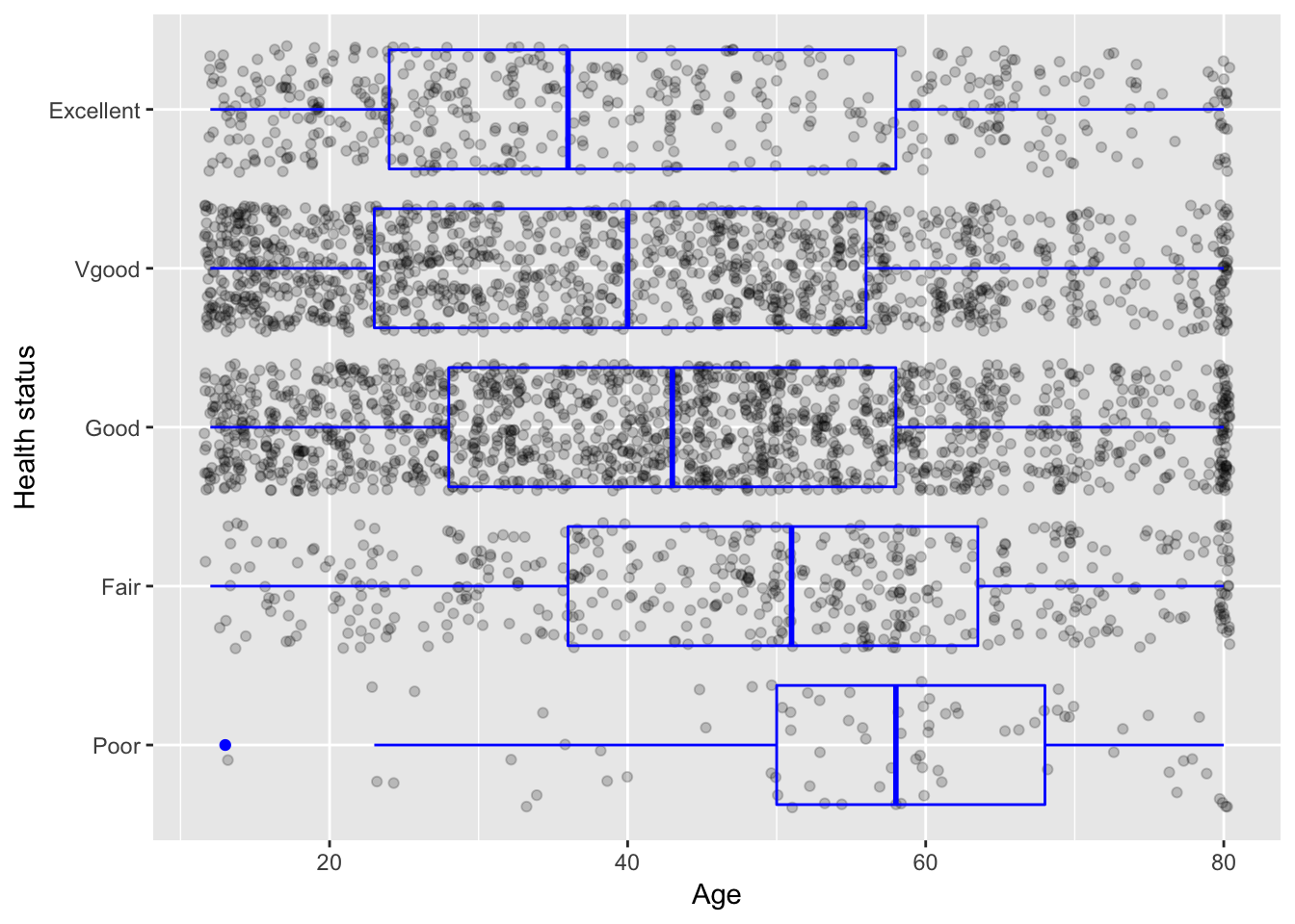
At plot like this, which puts the data at the center, might even make it easier to explain what a box-and-whisker plot is … and what it isn’t. And since a computer is doing the drawing, why limit yourself to a display of distribution based on just five numbers? But that’s a story for another time.
