Stem-and-leaf displays are a pedagogical device for helping students think about leading digits. They are also a graphical modality for displaying distributions of numbers, but one that is firmly grounded in the era of “small data” and typewriters. Here’s an example, showing the distribution of horsepower of the cars in the mtcars data set that comes with R.
##
##   The decimal point is 2 digit(s) to the right of the |
##
##   0 | 5677799
##   1 | 0011111122
##   1 | 55888888
##   2 | 123
##   2 | 556
##   3 | 4
It seems that cars with engines around 100 hp are more common than cars in the two-hundreds and above.
I don’t know whether there are many college-level instructors who continue to teach stem-and-leaf displays. Whatever the virtues of helping students develop a sense of number scale, they are not used in practice and, I think, they can be hard for people in the general public to understand.
Still, there are two aspects of the stem-and-leaf display that I like:
- The variable being plotted is on the vertical axis. That’s where a response variable should always be. 1
- The horizontal axis is scale-free. That is, our visual interpretation focusses on the shape of the display rather than the numerical values.
This contrasts with the usual histogram or density graph where the response variable is on the x-axis and the vertical axis is taken up by a scale that we pay little attention to.
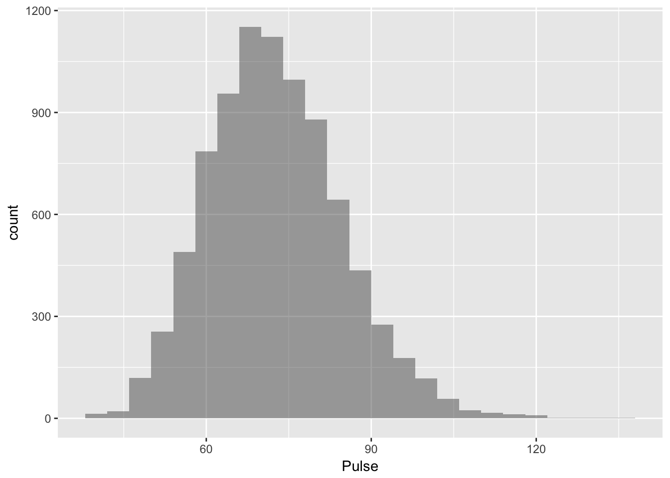
To illustrate, here is a conventional histogram showing the pulse rates of 8,563 people in the NHANES dataset we so often use in StatPREP.

Once outside the realm of small data, the stem-and-leaf display just doesn’t work:
##
##   The decimal point is 1 digit(s) to the right of the |
##
##    4 | 0000000002222444444444444
##    4 | 66666666688888888888888888888888888888888888888
##    5 | 00000000000000000000000000000000000000000000000000000000000000000000+256
##    5 | 66666666666666666666666666666666666666666666666666666666666666666666+409
##    6 | 00000000000000000000000000000000000000000000000000000000000000000000+1177
##    6 | 66666666666666666666666666666666666666666666666666666666666666666666+958
##    7 | 00000000000000000000000000000000000000000000000000000000000000000000+1641
##    7 | 66666666666666666666666666666666666666666666666666666666666666666666+916
##    8 | 00000000000000000000000000000000000000000000000000000000000000000000+1145
##    8 | 66666666666666666666666666666666666666666666666666666666666666666666+459
##    9 | 00000000000000000000000000000000000000000000000000000000000000000000+390
##    9 | 66666666666666666666666666666666666666666666666666666666666666666666+98
##   10 | 00000000000000000000000000000000000000000000000000000000000000000002+79
##   10 | 6666666666666666688888888888888888
##   11 | 0000002222222222244444
##   11 | 666666688888
##   12 | 0000002224
##   12 | 688
##   13 | 4
##   13 | 6
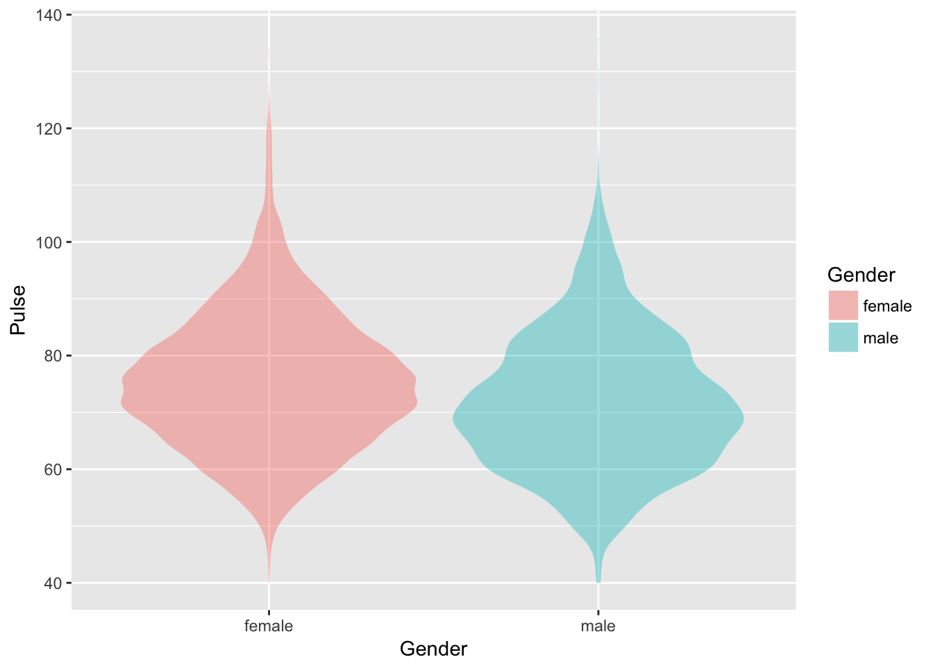
Happily, there is a graphical modality that is suitable for large numbers of cases and that, like the stem-and-leaf display puts the response variable on the vertical axis. It’s called a violin plot.

Violin plots easily enable you to see the shape of the distribution. It doesn’t really matter that the numerical value of the density is not displayed on the graph; we rarely use that information. Notice also the benefit of leaving off the density scale: the horizontal axis is now available for use by an explanatory variable, in this graph gender.
Almost always we are interested in an explanatory variable, so it’s nice to have a graphical technique that makes it easy to include one in a display.
As a rule, I think it’s helpful to avoid special-purpose displays like stem-and-leaf. My recommendation is to teach with the same displays that will actually be used for data, like this one (which lays out axes in the traditional format) or this one. Still, you are the one who knows your students the best and are in the best position to decide whether introducing stem-and-leaf displays is helpful for them. If you do want to go that way, this app’s for you.
The Stem-and-leaf app
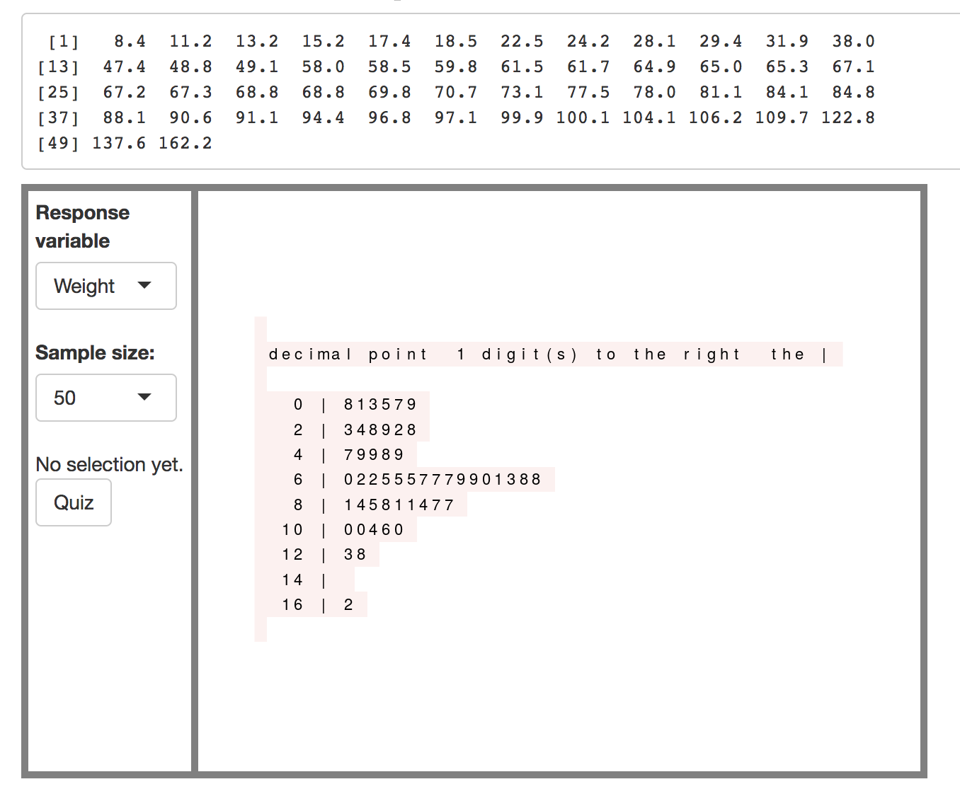
The app is very simple as befits something used early in a course and won’t be used again. At the top is a compact list of numbers in R format. This is a sample from the NHANES data. You’ve got access to several variables, height (cm), weight (kg), heart rate (pulse: beats per minute), the age at which smokers started, the self-reported number of days of bad mental health in a month. These are familiar quantitites to all students.
The basic action: click on one of the numbers in the stem-and-leaf display. The corresponding entry in the number list is highlighted.
There’s also a “quiz” mode. Pressing the quiz button selects a target. The student’s goal is to find the corresponding digit in the stem-and-leaf display.

Teaching with the app
Let’s frame some learning goals.2 Perhaps:
- Understand what is meant by a pattern in data.
- Realize that graphical displays can make it easier for people to see patterns.
- Distinguish between the location of an individual data point in the display and the overall pattern showed by the collection of data.
- Learn common ways of describing the distribution of numerical values.
In class, bring up the app where everyone can see it. Use either height or weight to start.
In introducing the app, I would start with the number list at the top. (Note, I like to have a large enough sample size that it’s hard to assimilate the number list by eye. Say, n = 50.)
- What’s the smallest value?
- What’s the largest value?
- What’s the middle value?
- What range of values is the most typical? This is a much more subtle question, since “typical” has to be defined. And it’s a hard question to answer from directly from the data. Let the students struggle with this a bit.
Then move down to the stem-and-leaf display. Point out that there is one digit for each of the numbers in the list. Show where the smallest and largest values appear in the display, clicking on them to show the correspondence with the number list. Then click on a few in the middle of the diagram.
- What are the most common or typical values?
The display itself provides a framework for defining “typical,” the length of individual lines and bunches of long lines.
- What’s the overall pattern displayed by the diagram?
Be prepared to introduce the idea of pattern. Describe some kinds of patterns commonly seen in the distribution of values:
- Most common values are near the center, vs most common at one end or the other.
- Fanning out. Values becoming less common as you move away from the center.
- Hard limits. For instance, there can be no weight below 0 kg.
- Long tails.
- The tails are more or less the same shape on either side of the center.
- The tails have different shapes on either side of the center.
Move to the other variables in order to continue the discussion about pattern.
- What can you say about the patterns by looking at the numbers?
- What can you say about the patterns by looking at the diagram?
In answering questions about the tails and such, you may want to increase the sample size sharply. Long-tailed distributions are best seen with large sample sizes.
Throughout, show by clicking that each digit in the diagram corresponds to one number in the list of numbers. And each number in the list contributes a little bit to the overall shape of the diagram.
Evaluation
Using a printed stem-and-leaf diagram.
- Circle one (or more) of the digits. Students should write down the data value (as well as it can be approximated) for each of the circled digits. The decimal point should be in the right place.
- Give one (or more) data values that are not in the display. Students should determine the place where that value would be inserted and draw an X where each new value would be placed in the display.
- Figure out the median value of the data. (Not the mode. Height and weight are both continuous variables.)
- Write down the range of numbers that is included in the longest line in the diagram.
With due acknowledgement to the economists, who put the independent variable on the vertical axis.↩
Notice that “learn to make a stem-and-leaf display” is not one of the goals. Some instructors may hold that constructing a display is a tactic for accomplishing the other learning goals. Perhaps. But watch out for “mission creep.” It’s easy for the tactic to become and end in itself.↩
