The LittleApp on “Why use density?” focusses on helping students understand why we prefer to display distributions in the form of a density rather than as counts across bins. It also helps introduce students to the idea of a response variable and an explanatory variable.

As with other LittleApps, there are controls to select the response and explanatory variables. You’re given a choice here for a couple of reasons:
- It’s easy to bring up new examples.
- Often there is an illuminating everyday story depicted by the graph.
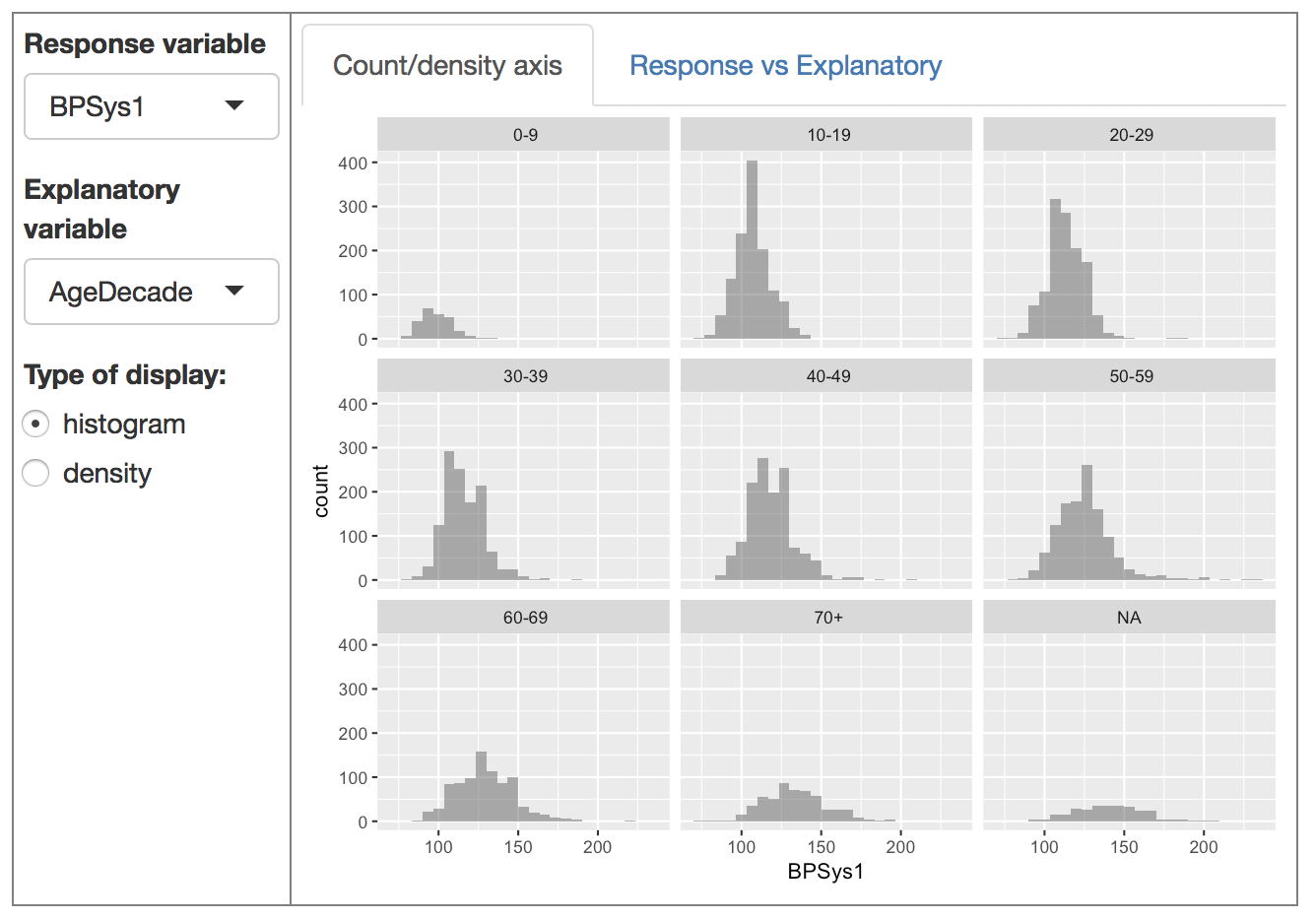
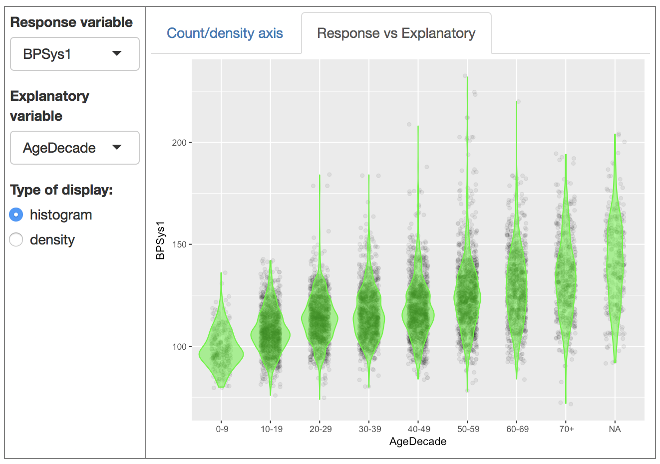
As always, we encourage you to take the time to draw this story out from your students. An example: In blood pressure versus age decade you’ll see that older people tend to have both a higher person-to-person spread in blood pressure and, as a group, a higher pressure itself1 Anothe example: Looking at height versus work status shows a curious pattern: the NA’s (that is, the people for whom working status is missing) tend to be shorter than the other groups? Why? You can speculate and then show height vs age, which makes the reason clear.
Simply by playing around with the selection of explanatory and respose variables, you’ll come across interesting stories.
Orientation to the app
There are two main graphical displays:
- a “conventional” plot of count or density versus the response variable, with facets for each level of the explanatory variable
- a plot in the response-vs-explanatory format, with the distribution in each group shown with a violin plot.
You switch between them by selecting the appropriate tab containing the graphics displays.

Teaching with the app
Bring up an explanatory variable which has substantially different number of people in the various groups. The histogram display mixes together two things: the overall height of the bars reflects the number of people in the group, while the variation across bars shows the distribution of the response variable within each group. Unfortunately, when the explanatory groups have very different numbers of people, it can be hard to make out the shape of the distribution.
The density plot makes it easier to see the shape of the distribution. On the other hand, it suppresses the information about the number of people in the various groups. For comparing distributions, the density is easier to make sense of than the count. But the need to use faceting to display the explanatory variable gets in the way of seeing such differences in distribution.
The response-vs-explanatory format gives you simultaneous access to the relative number of points in each group and to the distribution within each group in a way that makes it straightforward to compare the different groups.
For instructors
As stated before, we encourage you to play with the app to discover interesting stories in relationships between response and explanatory variables. As you do this, look at both of the graphic displays. If you find it easier to work with the response-vs-explanatory format, make note. This is why it can be useful to switch from traditional displays (e.g. histograms) to displays that take advantage of the ability of computer graphics to work with color and transparency.
Instructors coming from a probability background will think it natural to display probability density functions with the y-axis given over to the probability density scale. This makes sense if your purpose is to show a normal or exponential or some other theoretical distribution. But when it comes to data, our purpose is usually something else: to show how the distributions compare to one another.
A standard definition of “high blood pressure” is a pressure above 130 mmHg. You can ask students to estimate the fraction of people in each decade who have high blood pressure according to this definition.↩
